Your Thumbnail is Your Ad: 5 Design Principles for Clickable YouTube Thumbnails
On YouTube, your video is judged entirely by its cover. You could pour your heart and soul into creating the most insightful, life-changing, value-packed video in the history of your industry. But if your thumbnail is bland, blurry, or confusing, no one will ever click to find out. It's a harsh reality. Your thumbnail isn't just a preview; it's a miniature billboard competing for attention in one of the most crowded marketplaces in the world. A weak thumbnail doesn't just hurt your views; it renders all your hard work invisible.

The Promise of a Single Click
Before we dive into the nitty-gritty of design, let's get the philosophy right. The job of a great thumbnail is to do two things simultaneously:
1. Accurately represent the video's content.
2. Create enough curiosity to earn a click.
It's a delicate and crucial balance of clarity and intrigue. Think of your thumbnail as a promise. It makes a promise of value, a solution, or an interesting story. Your video's job is to deliver on that promise. A "clickbait" thumbnail that lies breaks trust with your audience, while a boring thumbnail that undersells your amazing content is a massive missed opportunity.
The 5 Unbreakable Rules for Clickable Thumbnails
So, how do you master this balance? Over the years, I've found that the best-performing thumbnails consistently follow five core design principles. These are the YouTube thumbnail best practices I use as a foundation for every single piece of graphic design for YouTube I create.
1. Bold, Expressive Faces
From the day we are born, our brains are hardwired to notice and respond to human faces. They convey emotion and connection in a way no other image can. A high-quality photo of a person showing a clear emotion—surprise, frustration, excitement, deep thought—is magnetic. It tells an instant story and makes the viewer wonder, "What caused that reaction?"
2. Large, Legible Text (3-5 Words Max)
Most people will see your thumbnail on a tiny phone screen while scrolling quickly. Your text needs to be massive, bold, and incredibly easy to read. A good rule of thumb is to use 3-5 powerful words that state the core value proposition or ask a compelling question.
Video Title: "My Complete Guide to Creating a Q4 Marketing Plan for Your Small Business"
Thumbnail Text: "Q4 PLAN: DONE" or "YOUR BEST Q4?"
The text should add intrigue or summarize the benefit, not just repeat the title.
3. High Color Contrast
Your thumbnail needs to visually "pop" off the page and separate itself from YouTube's white, gray, or dark interface. The best way to do this is with high-contrast colors. Think bold yellows against deep blues, or bright greens against a dark background. Adding a subtle outline or a drop shadow to your text can also lift it off the background image, ensuring it's readable no matter what. This is a core principle for creating clickable thumbnails.
4. Clear, Consistent Branding
As your audience grows, you want them to recognize your content instantly. Using consistent fonts and a defined color palette creates a cohesive, professional look across your entire channel page. It signals that you are a serious creator who pays attention to detail. This doesn't mean every thumbnail looks identical, but they should feel like they belong to the same family. It's a key part of developing your advanced branding visuals and is especially vital if you're building a channel for your show, a core topic in The Podcaster's Guide to YouTube.
5. Uncluttered, Simple Composition
Less is almost always more. A busy, cluttered thumbnail with too many elements is confusing to the eye. The brain doesn't know where to look, so it looks away. A great thumbnail has one clear focal point—either your face or a key object—and a few words of text. Embrace negative space (the "empty" areas) to give your important elements room to breathe. Remember, you're not just adding text; you're using strategic graphics to elevate your videos and their first impression.
I Design the Ad for the Masterpiece We Create
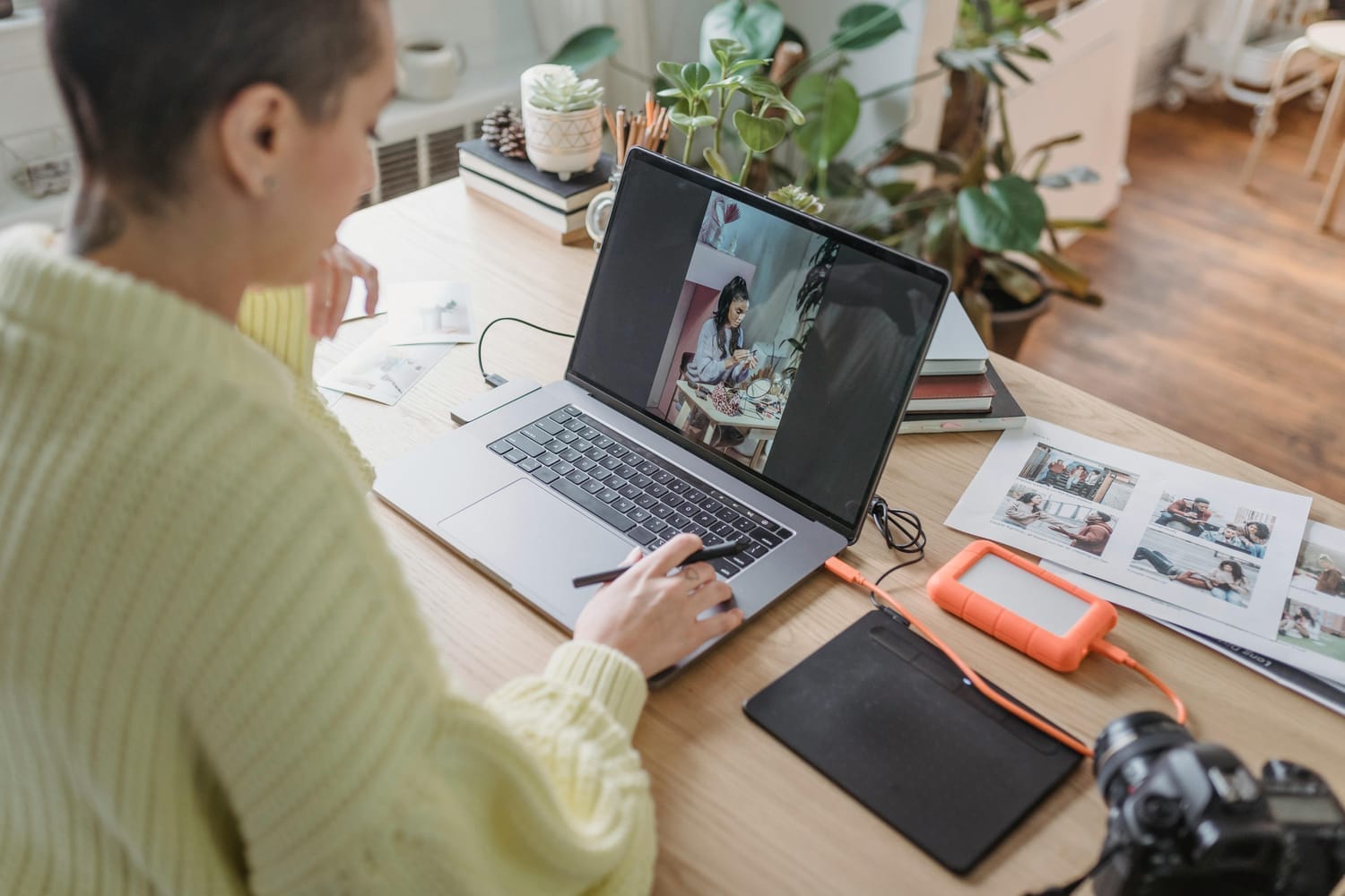
Thumbnail design isn't an afterthought; it's a critical part of my "Done-For-You" video editing service. It’s the final, crucial step that ensures the beautifully edited, value-packed video we just created actually gets seen and appreciated.
My remote workflow makes this seamless. You focus on being the expert and filming your content. You upload the raw files, and I get to work editing the video and designing the ad for it. By combining proven graphic design principles with YouTube's best practices, I create compelling, on-brand thumbnails that act as your video's hardest-working salesperson, 24/7.
Stop Wasting Great Content on Bad Covers
Your content deserves to be discovered. Don't let a weak "cover" hide your brilliant work. By focusing on these five principles—Emotion, Clarity, Contrast, Branding, and Simplicity—you can create thumbnails that not only look professional but also work tirelessly to bring you the audience you deserve.
Want your videos to get the clicks they deserve? Let's design compelling, on-brand thumbnails for your YouTube channel.